Branding & Experience
What makes a website feel premium
A practical breakdown of the design decisions that make a website feel premium for architecture and interior design studios.
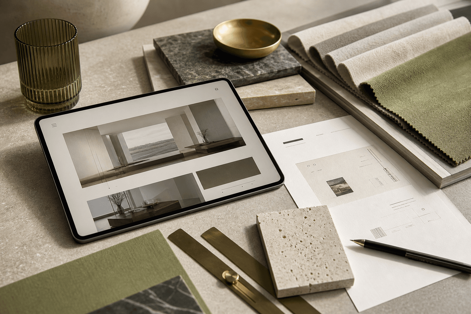
It starts before you read a single word
Premium is a feeling that arrives before the content does. In the first fraction of a second, visitors absorb the weight of the typography, the restraint of the colour palette, and the quality of the images. Before they've read your name or your tagline, they've already formed a judgement.
For design studios, this matters more than almost any other industry. Your clients are people with highly refined visual taste. If your website doesn't meet them at that level, you lose credibility before the conversation begins.
Restraint is the hardest thing to design
Most websites try to communicate everything at once: services, testimonials, awards, a contact form, a blog, a video, a chat widget. The result is visual noise that signals effort but not confidence.
Premium websites do the opposite. They make deliberate choices about what to show and what to leave out. Every element earns its place. White space is used actively, not passively. It gives the eye somewhere to rest, and it communicates that you're not desperate to fill every corner.
Typography is the silent voice of your brand
The typefaces you choose, the weight hierarchy you establish, and the line-height you set all communicate personality before a single sentence is read. Thin, spaced serif headlines suggest refinement. Dense, compressed grotesques suggest energy and urban edge. Neither is wrong. Both must be intentional.
For interior design and architecture studios, typography is often the single biggest lever for elevating perceived quality. A generic system font at 16px says template. A considered typographic system says this studio sweats the details.
Image quality is non-negotiable
A premium website with poor photography is like a luxury hotel with stained carpets. The gap between the promise and the reality damages trust more than a simple, honest website would.
If your photography isn't ready, a minimal launch that holds space for future images is better than filling your site with placeholder visuals. Clients will respect restraint. They will not forgive low quality.
Interaction should feel inevitable
Hover states, page transitions, scroll animations: when done well, these are nearly invisible. They feel natural, as though the website is responding to your presence rather than performing for it. When done poorly, they draw attention to themselves and undermine the very quality they were meant to signal.
The benchmark for premium interaction design is not does it animate? but does it feel like it couldn't work any other way?